
WHO

Training Your Best Salesperson
Rush Ready: a BFCM 2026 series with Airwave
This is Part 2 of Rush Ready, the Black Friday – Cyber Monday series we co-wrote with Marie of Airwave, a fashion agency specializing in email marketing and Meta ads. (Missed Part 1 on landing pages? Read it here.) This one is all about product pages: Marie covers what your page should say, and we cover how and where to say it.
I’m sure you’ve already heard how important the product page quality is to driving sales conversions. Today, I’m going to walk you through two methods for optimizing it in time for the rush. I’m also joined by Christine Corbin of Thread & Co. to bring the second half on how and where to say it for best results.
A good salesperson always follows up to what caught your eye. Your product page is that salesperson and for a capsule, limited edition, hand sewn piece, it has one job: justify the price before the shopper hesitates.
There are two ways to do this:
Weave best ad content into product page
If you’re running ads, insert your top performing ad content into your product page. My checklist for what and where:
- Top ad hook is the first line of the description
- Best ad image or video is in the first three gallery slots
- The price is explained in three lines beside it
- The top question from ad comments is answered here
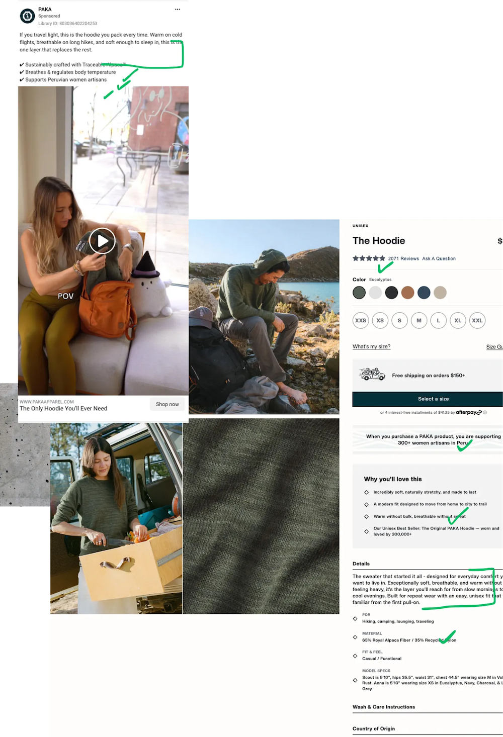
Paka’s longest running ad for a bestselling hoodie.
Here’s an example from Paka. This is their longest running ad (March) for a bestselling hoodie. The product page includes everything from the ad and more. There is strong continuity in message and while the ad addresses the traveler avatar, it zeroes into all the above elements right on the page, applicable to travelers and beyond.
Tell the “why this price” story
Here’s another way to approach this. Someone sees $980 on a bag, but their reference point is $360 for a similar design. The issue isn’t the price but the difference. Something like “It takes 3 days to handweave, and is made only in forty units a year” Spotlights process, names numbers, lists specifics over generalities. Notice the difference between “Ethically made” and “Sewn by a team of six in Sofia.” Even if sometimes it’s a team of five or seven.
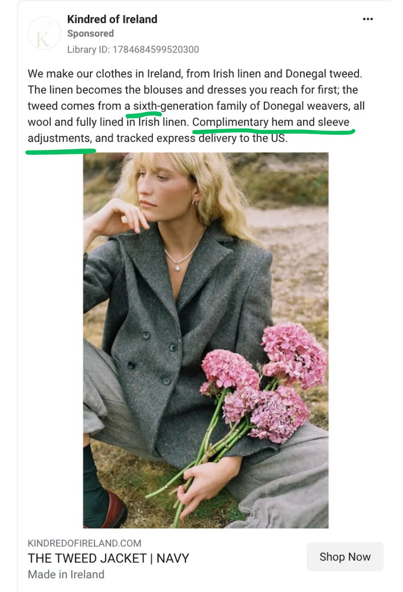
This ad spotlights process, names numbers, lists specifics over generalities. Notice the difference between Ethically made and Sewn by a team of six in Sofia.
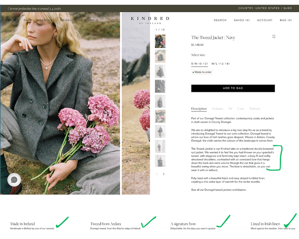
Specific sourcing detail spotlights process, names numbers, lists specifics over generalities.
Over to Christine
Even if we know what to say, now we need to look at how and where to say it. This is where Christine comes in on which photo goes first, where reviews are most compelling, and how to say “4 left” without sounding like a flea market.
Your product page checklist
Your product page template is make-or-break for building trust, especially for first time buyers coming from ads. You need to answer their questions fast, on a small screen (most often mobile!), while still feeling premium.
Photo order
Your photo gallery does the job a shop assistant does when they physically hand you the piece. A checklist of considerations:
- First image is the hero from the ad
- Second image is an on-body or in-use shot
- Then close-ups of the handmade details (stitching, texture, material)
- Then a shot that shows size and scale
Remember: real, in-context photos are becoming a trust signal for premium brands, and your photos need to match what shows up in the box. Your product page is a promise to the customer.
Above the fold (with reviews)
You’re most likely to lose a new shopper on mobile before they’ve ever even scrolled. So, every bit of above-the-fold space needs to count. Make sure you’re including:
- Price and size options, with the size guide right next to the size selector
- A sticky Add to Cart button
- Star rating and review count near the product title
- Shipping timeline and returns info up front
Here’s a tangible example. Smaller brands often fit much less above the fold, while Marla Aaron – a luxury brand I love! – fits price, sizing, a sticky checkout button, the shipping timeline and basic product info without any scrolling:
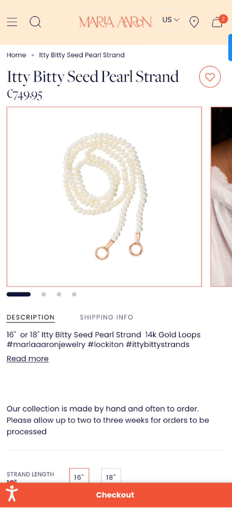
Smaller brands often fit much less above the fold, while Marla Aaron fits price, sizing, a sticky checkout button, the shipping timeline and basic product info without any scrolling.
Honest scarcity
Handmade and luxury brands already have real scarcity, so there’s no need to fake it. Whenever possible, state real batch sizes (IE “small batch of 40”), and only show low-stock flags when they’re tied to actual inventory. Make sure you’re also being upfront about holiday shipping and lead times!
Run through this list on your own phone this week, and add anything missing to your fix list before peak traffic starts.
Want your product pages selling at full price before BFCM? Book a call with Thread & Co.
Not sure which ad angles deserve a place on the page? Talk with Airwave.
Next up: Part 3, BFCM without the bargain bin.
